How to Graph a Modified Goodman Diagram in Excel
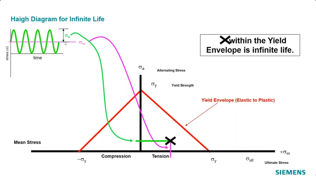
A Modified Goodman Diagram is a tool used in engineering, especially in fatigue analysis, to evaluate the life of materials under alternating and mean stress conditions. It helps to determine the safety factor in fatigue failure of materials, balancing between ultimate strength, yield strength, and endurance limits. Creating this graph in Excel is useful for visualizing the safe operating conditions for a given material.

Below is a step-by-step guide on how to graph a Modified Goodman Diagram in Excel.
The Ultimate Guide to Downloading Excel: Tips, Tricks, and Best Practices
Excel Spreadsheet:The Power of Spreadsheets
Step 1: Collecting Necessary Data
Before plotting the diagram, you need three key material properties:
- Endurance Limit (Se): The stress level below which the material can theoretically endure infinite cycles without failing.
- Ultimate Tensile Strength (Sut): The maximum stress that a material can withstand before failure.
- Yield Strength (Sy): The stress at which a material begins to deform plastically.
You will plot alternating stress (Sa) on the Y-axis and mean stress (Sm) on the X-axis.
Step 2: Defining the Equations for the Modified Goodman Diagram
The basic equation for the Modified Goodman Line is:
[
\frac{S_m}{S_u} + \frac{S_a}{S_e} = 1
]
Where:
- (S_m) is the mean stress,
- (S_u) is the ultimate tensile strength,
- (S_a) is the alternating stress,
- (S_e) is the endurance limit.
The Yield Line can also be included, defined by the following:
[
S_a = S_y – S_m
]
Where:
- (S_y) is the yield strength.
Step 3: Creating the Data Points
In Excel, generate two columns for Mean Stress (Sm) and Alternating Stress (Sa).
- Mean Stress (Sm):
- Begin from 0 up to the ultimate tensile strength (Sut).
- Increment this column by equal steps, such as 100 MPa, depending on your material’s range.
- Alternating Stress (Sa):
- Using the Goodman line equation, calculate (S_a) for each (S_m).
- In Excel, the formula will be entered like this:
= (1 - (Sm/Sut)) * Se
Step 4: Plotting the Data
- Select Data:
- Highlight the columns containing your Mean Stress (Sm) and Alternating Stress (Sa).
- Insert Scatter Plot:
- Go to the Insert tab, select Scatter Plot under the chart section, and choose the version that creates a simple scatter without lines.
- Add the Yield Line:
- Create a third column for the yield line equation.
- Use the formula ( S_a = S_y – S_m ), calculating values for (S_m) from 0 to (S_y).
- Add this as a second series in the scatter plot by right-clicking the chart and selecting Select Data, then choosing Add Series.
Step 5: Customizing the Graph
- Chart Title:
- Click on the chart and add a title like “Modified Goodman Diagram” by selecting Chart Title from the Design tab.
- Axis Labels:
- Add labels to the X-axis (Mean Stress) and Y-axis (Alternating Stress) by selecting Axis Titles under the Layout tab.
- Adjust the Axis Ranges:
- Right-click on the X-axis and Y-axis, and set the maximum values to the ultimate tensile strength (Sut) and endurance limit (Se), respectively.
- Adding Trendlines (Optional):
- If you want to display the Goodman line and Yield line more clearly, you can add a trendline for each of them. Right-click on the data series and select Add Trendline.
Step 6: Finalizing and Analyzing the Diagram
- The graph should now display a curve representing the Goodman line and a straight yield line.
- The area beneath the Goodman line is considered the safe operating region for the material, while anything outside indicates potential failure under the given stress conditions.
What Movies And Shows Have The Song Swan Lake
What Movie Features Eskridge Martial Arts
Step 7: Interpreting the Diagram
In the graph:
- Alternating Stress (Sa) values below the Goodman curve indicate that the material will likely survive the stress cycles.
- Mean Stress (Sm) helps you determine the range where the material will safely endure repetitive loading.
This diagram is essential in assessing whether a design is robust enough to handle both alternating and mean stress conditions.
Additional Tips for Graphing in Excel
- Gridlines: You can adjust or remove gridlines to improve the readability of your graph.
- Color-Coding: Use different colors for the Goodman line and the Yield line to make them distinguishable.
- Annotations: You can add data labels to significant points like the ultimate tensile strength, endurance limit, or yield strength to emphasize important material properties.
By following these steps, you can efficiently create a Modified Goodman Diagram in Excel to assess material fatigue and design safety.
